
A full rebrand and website redesign for a U.S. business funding company, taking Capital Loan Specialist from a generic template to a distinctive brand, a structured site, and a real loan application.
Before: A Lender That Looked Like a Template
Capital Loan Specialist helps U.S. small business owners access funding. In a category built on trust, the old site worked against it: a generic navy template, a plain text logo, and a testimonial that actually praised a different company. There was no real way to apply either, so leads leaked into WhatsApp and Telegram, impossible to track or measure. My job was to rebuild all three: the brand, the structure, and the path to apply.
What This Project Taught Me
In lending, design is credibility. Every decision, from the logo to the order of the form fields, had to answer the same question: would a business owner trust this enough to hand over their financials and bank details online? The lesson that stuck: a good form is a conversation, not a wall. Opening light and saving the heavy questions until after a pre qualification win made people far more willing to finish. And moving leads out of chat threads into a structured flow didn't just look more professional, it gave the business something it never had before, real visibility into its own funnel.

See More Work
More products, systems, and experiences I've designed.
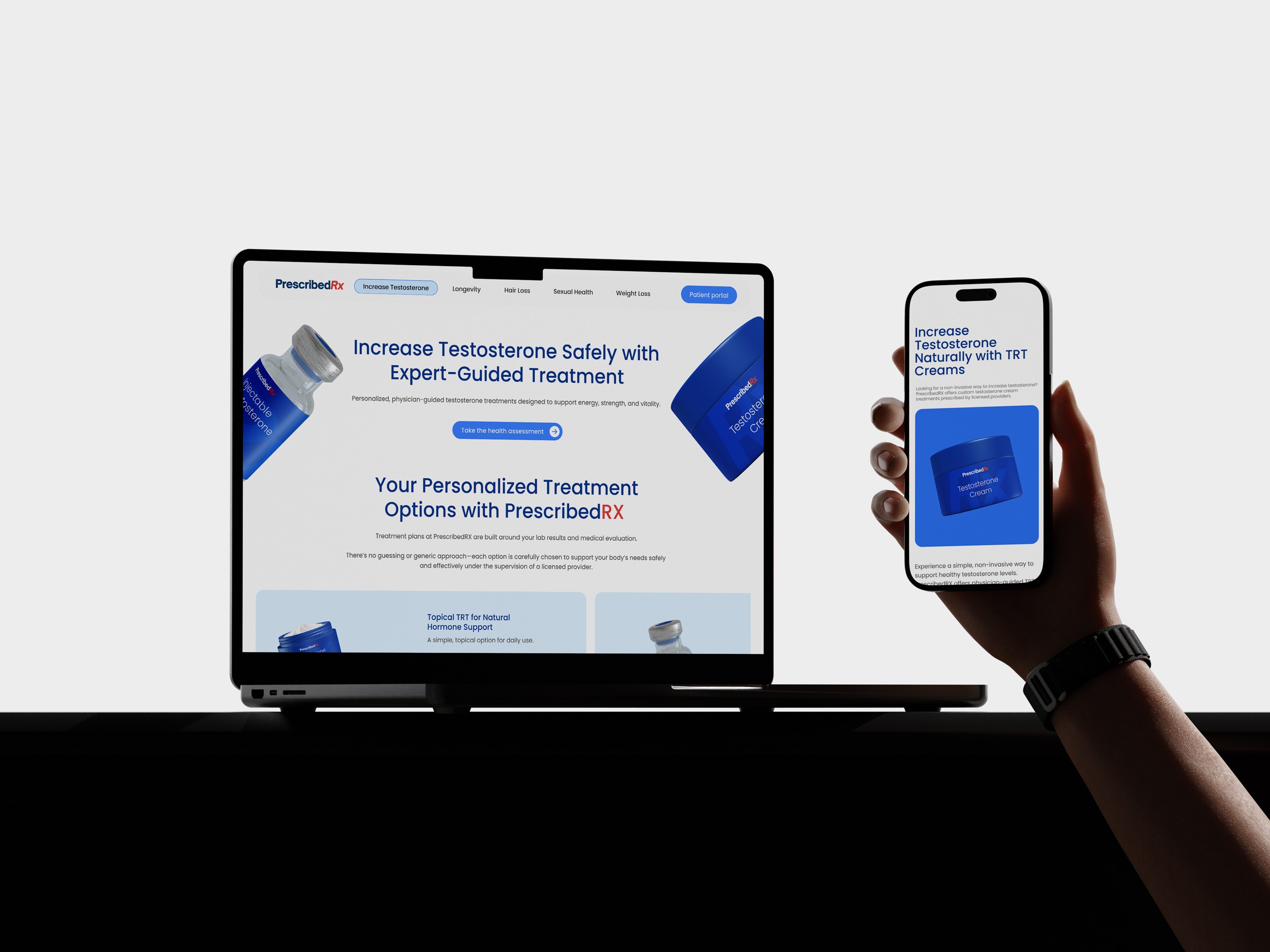
PrescribedRX
Medical Telehealth & E-commerce
Revitalizing a telehealth brand by reducing task completion time by 40% through a streamlined sitemap and a unified digital-to-physical identity.
Health-tech
E-commerce
Brand Identity
Packaging
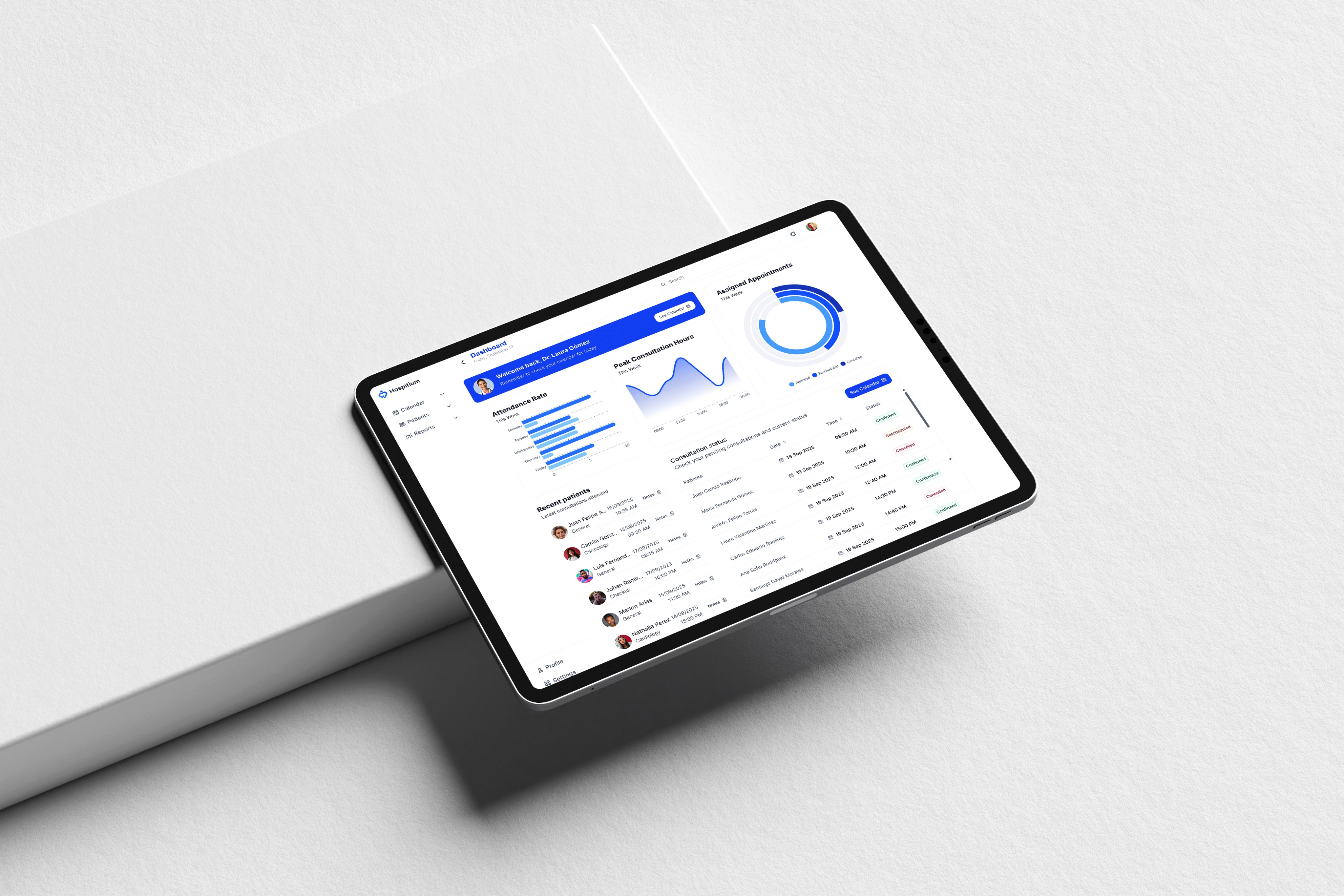
Hospitium
Centralized Healthcare CMS
Cutting average appointment time from 20 to 12–15 minutes through a centralized CMS that puts patient history, exam results, and treatments in one place, while enabling efficient remote scheduling for patients.
B2B CMS
Healthcare IT
Product Strategy
Workflow Optimization

#030416
#00A8E8
The Challenge Was Threefold

Rebuild the brand so it feels as secure and established as a bank's lobby. Restructure a generic, template layout into one clear path to apply. And turn an informal, invisible lead process into a structured funnel the business could actually see and measure.
The Results


The redesign moved an entire lead pipeline out of chat apps and onto a measurable website. Three shifts stand out.
Leads Moved On-Site
Before, inquiries lived in WhatsApp and Telegram threads. Now the website is the funnel, and prospects complete a structured application on the site instead of in a chat. That single shift removed a manual bottleneck from every lead.
Every Lead Is Now Traceable
The business captures each application cleanly: who applied, what they qualified for, and whether the loan was approved or declined and why. What used to be scattered messages is now structured, actionable data.
Measurable for the First Time
Built on WordPress, the new site made the funnel measurable at all. It opened the door to GA4, Hotjar, and CRM integration, so the team can finally track and improve conversion instead of guessing.
The Brand
The rebrand is the clearest before and after in the project, anchored by three words: fast, flexible, multiple

01.
The Logo
Before: a plain text "CLS" lost on a navy template.
Now: a distinctive mark built from two interlocking diamonds, a connection between lender and business, paired with a clean Inter wordmark and lockups for light and dark.
02.
The Color
Before: ordinary corporate navy and steel blue.
Now: a signature cyan (#00A8E8) grounded by a near black ink (#030416) and clean white space, modern and sure of itself.
03.
The Type
Before: generic text and a testimonial praising the wrong company.
Now: Inter across Regular, Semi Bold, and Bold, high contrast CTAs that make "Apply" pop, and real, verifiable proof backed by recognizable lender and press logos.
One Clear Path to Apply
The new site trades a dense template for one clear path. It spans a focused home page, six dedicated loan pages, and the core internal pages, each with one clean navigation route and a single obvious action per screen. Every layout is responsive across four breakpoints, from 1920px down to 360px.

The Application Is the Product
The old "Apply" button led nowhere. The redesign turns the application into the product: a multi step flow that opens light to earn commitment, then asks for more only once the user is invested. It runs from funding needs to an eligibility check, delivers a pre qualification win, then collects business, owner, and bank details before closing with an
e-signature. Two paths fit different applicants, and it all works on mobile.

From One Page to a Connected Architecture
The old site was a single scrolling homepage. Everything lived on one page, with no product pages, no internal sections, and no real way to apply. The redesign is a full, connected architecture: a focused homepage that routes into six dedicated loan product pages, content pages for Learn, About, and Contact, and a multi step application form. Every product and every call to action funnels to the same place, the application, so no path is a dead end.

Before
One page, no structure, and leads leaving the site to apply.
Now
Homepage, products, content, and the application form are all connected, with a clear route from landing to a submitted application. Every "See my options", "Check my eligibility", and product page leads into the same funnel.