PrescribedRX is a U.S.-based telehealth platform offering personalized hormone therapy, hair loss, sexual health, and weight management treatments.
The company had an active social presence and a paid-lead generation strategy, but nothing to convert that traffic into patients. The starting point was minimal: a logo and a two-color palette that hadn't yet found its hierarchy. No website, no brand system, no product packaging, no patient experience.

#003566
#E03C37
The Challenge Was Threefold
Build a full brand identity from two assets, design a product experience trustworthy enough for users to share personal health data without ever visiting a clinic, and structure an information architecture that could teach, reassure, and convert across distinct treatment categories.

Strategy
Product Research
IA Content
Content Strategy
Discovery
Wireframes
Design System
UI Design
Brand System
Implementation
Packaging Design
Branding
Designing High-Fidelity Screens
Handoff to Development
Design QA
Iterations
As Lead Designer, I owned the end-to-end structure of the platform:
defining the site's information architecture, deciding which sections were essential to guide a first-time visitor toward treatment, designing how each product category would be presented, and mapping the purchase flow from discovery to prescription for every treatment type.
Packaging Design

Site Architecture
What started as a straightforward e-commerce brief evolved into a full education-to-conversion system.
Each treatment category needed to answer the same set of questions before a patient would commit:
what is this treatment, how does it work, what are the benefits, how does the PrescribedRX process work, why choose us, and critically is this right for me.

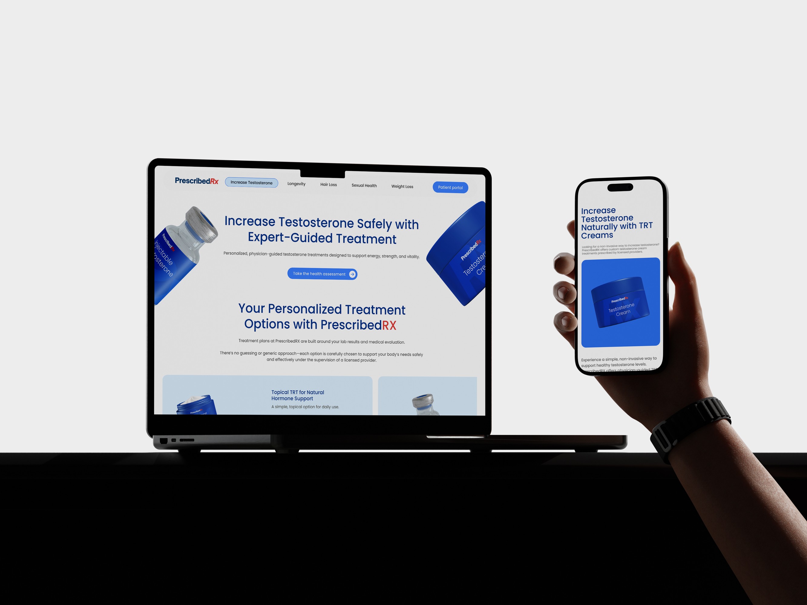
The final architecture organizes five treatment categories (testosterone, hair loss, sexual health, weight loss, and longevity), each with dedicated landing pages, individual plan pages for specific formulations, a three-step process explainer
select treatment → provider consultation → discreet delivery
Patient testimonials, and an FAQ built to pre-empt medical and privacy concerns before checkout.
Virtual First &
Discreet Care

The entire patient journey is designed to happen without a single clinic visit. Eligibility is validated through an at-home test kit, reviewed remotely by a licensed provider, with treatment shipped directly and discreetly to the patient's door. Privacy had to be designed into the experience itself, from how sensitive intake questions are framed, to how shipping and billing are handled discreetly, to how the interface reassures users at every step that this process is private by design, not just by policy.
Patient
Education
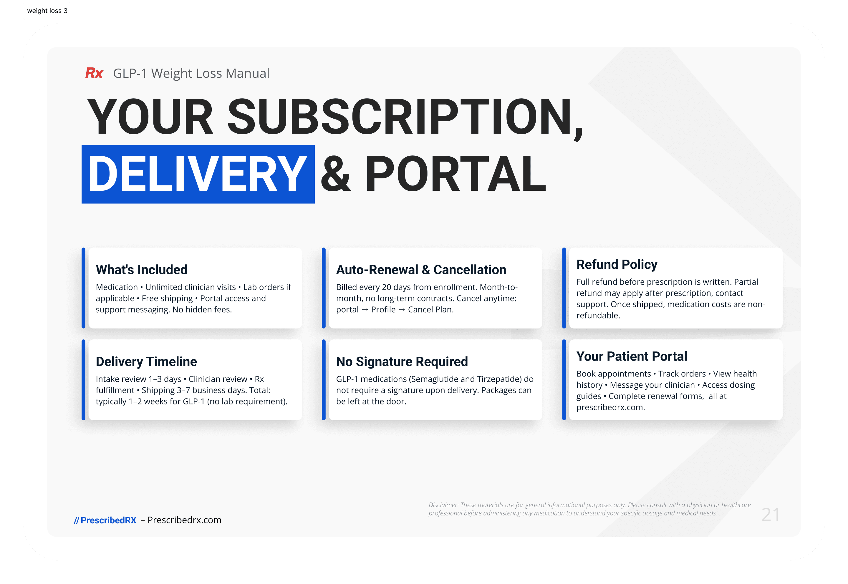
Beyond the site, patient manuals were designed for key treatment categories, testosterone replacement therapy and GLP-1 weight loss protocols, giving patients a clear, trustworthy reference for what to expect during treatment. These extended the brand system into a format patients could keep and return to.




Affiliate
Program
Beyond the core e-commerce experience, the brand system extended into a separate ambassador program, a community-driven page designed to recruit and showcase brand affiliates who help drive qualified traffic outside of paid channels. While technically hosted apart from prescribedrx.com, it shares the same visual identity and was designed as part of the same engagement, giving the brand a second acquisition channel beyond direct-to-consumer marketing.

The Results
Purchases Increase
Since launch, PrescribedRX has grown traffic by roughly 8–10% month over month, with monthly treatment purchases rising from a range of 40–50 to 65–70.
Brand Ambassadors
The platform's credibility as an established brand has also opened doors beyond direct sales. PrescribedRX now works with 5 brand ambassadors, a mix of athletic trainers and sports influencers
Cross-Brand Partnership
Formed a partnership with Christopher's Kitchen, a plant-based healthy-eating restaurant, opening the door to further cross-brand collaborations.
Shift in Leads
inquiries that used to flow through Instagram DMs and WhatsApp chats now route directly through the website, cutting manual intervention out of the process and letting patients move from discovery to purchase faster and with less friction.
What This Project Taught Me
Every decision, from the two-color palette to the intake form copy, had to answer the same underlying question:
Would I trust this enough to share my health history with it?
The hardest lesson was resisting the instinct to lead with conversion. It would have been easy to copy a straight e-commerce funnel and call it done. Choosing to teach before selling treatment by treatment, category by category, slowed the initial build but made the system easier to extend later, from patient manuals to the affiliate program.
I also learned how much a brand system gets tested the moment it leaves the site it was built for. Watching the same colors and typography hold up on an entirely separate ambassador page confirmed the foundations were solid, that's not something you can validate until someone else builds on top of your system.
See More Work
More products, systems, and experiences I've designed.
Fleet Defender
Cybersecurity & Fleet Management SaaS
Scaling real-time security for 6,000+ vehicles, reducing incident response and resolution time to under 60 minutes.
B2B SaaS
Data Visualization
Real-time Systems
Security Design

Hospitium
Centralized Healthcare CMS
Cutting average appointment time from 20 to 12–15 minutes through a centralized CMS that puts patient history, exam results, and treatments in one place, while enabling efficient remote scheduling for patients.
B2B CMS
Healthcare IT
Product Strategy
Workflow Optimization